
Responsive Web Design – The Best Web Design Approach to Make Your Business Bloom
In a time – where 51.12% of internet traffic comes from smartphones- it is of utmost importance that the website designs are perfectly adjustable with mobile phones; whether it’s Android, iPhone, Kindle, and any other device. One shouldn’t be expected to lose customers just because their website isn’t compatible with a particular technology version, and to make separate web designs for every single resolution and device is completely far-fetched.
Website owners need to ensure immaculate user experience by employing an adaptable web design. For this, the most important components of web designs that are needed to uphold the customer usability and contentment are equally compatible design, content, and performance across all kinds of technological devices.

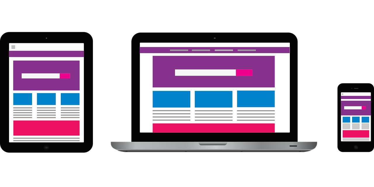
What is Responsive Web Design (RWD)?
Responsive Web Design is an approach that makes the web pages respond to user’s behavior on various devices, based on their respective platform and screen sizes.
To maintain uniformity, RWD uses similar information and data to provide the consistent design. It is proving to be a revolutionizing technology that is providing groundbreaking solutions for website owners.
Why Do You Need A Responsive Web Design?
As to whether you need RWD or not, the answer is simple; if you have ever received a complaint regarding your website creating havoc in a cell phone, or customers are judging you because apparently, your website doesn’t work on smartphones. Then trust me, you definitely need it!
According to Tyton Media, 94% of internet users mistrusted the websites because of their in-adaptability with cell phones. Moreover, websites that deploy Responsive Web Designs take up all the good spots on Google search pages, as SEO prioritizes such websites that are mobile friendly.
Websites like BMW, Urban Splash, Touring Birds, and many more are using Responsive Web Design and earning a huge turn over by retaining their customers using all kinds of devices.
How Does It Work?
Responsive Web Design basically works with JavaScript, CSS and HTML as programming languages to extend, show, hide and move the elements according to the user’s device. Its main components are,
- Fluid Grid: The websites are allowed to switch from fixed to fluid dimensions by RWD. The layout uses a fluid grid to size web pages in units like percentages rather than pixels. This means if the website was previously in certain pixels, it can now be customized to be as 100%. This allows the display to be adjusted to the full screen available, irrespective of the width of it.
- Responsive Images: It’s necessary that the images are also responsive, as they can affect the optimization. For instance, if the images of high pixels and size are opened in the small screen of smartphone and they fail to adjust to the new screen, it can worsen the user experience. Hence, RWD makes the images responsive using the same relative units. For this purpose, HISRC is also used, which makes the images display in lower resolution if the internet connection of the browser is slow or weak.
- Media Queries: RWD uses HTML and CSS to render the page being displayed follow certain rules which involve width and other features of the device. For example, if you want a tab or button that hides in mobile web format, you can do so with the help of media queries. You can also create multiple layout sheets for different widths like landscape or portrait mode.
What Are The Benefits Of Responsive Web Design?
- RWD allows the users to retain their previous user experience, no matter which device they are using.
- By using structural markup and the lines or web scripts, radical transformations can be created.
- Micro interaction for devices helps in creating a balance between text and images to make the display and layout of web page appealing.
- The better approach to features like gyroscopes and accelerometer is offered by RWD.
- It also provides reactive animation. These human-focused interactions are an important element, which adds a fun element to the whole user experience.
Conclusion
We are living in an era where new technologies are continuously being made. With these technologies come new screens of different dimension and to make our websites ever ready for these changes, Responsive Web Design is the best answer.

Although it doesn’t ultimately eliminate all the drawbacks and make it adjustable for every single device and user, it still is trending because of the best possible customer experience. Websites can be tailored for every gadget present on planet earth now, by only a small toil.
Converting your website in Responsive design can be easy if you have already conversed in HTML and CSS coding languages. We, at Heuristix, have experts in both these (and many more) languages, who can customize your website to make it user-friendly and responsive across all devices.